Naturli
Packaging Design

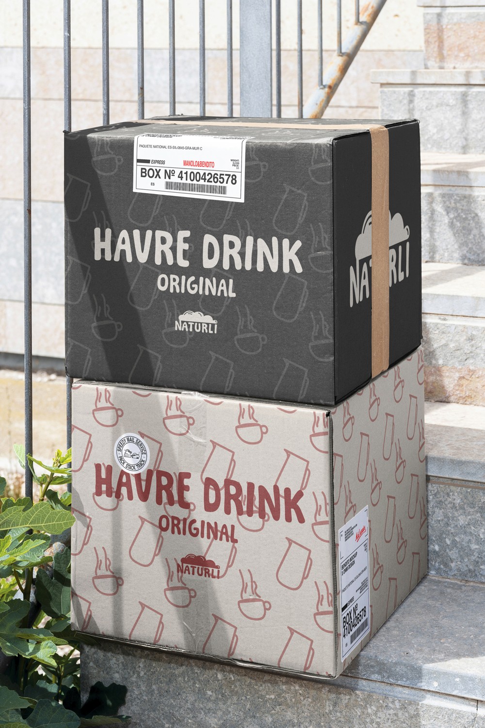
Naturli’s oat drinks are already a staple in many Nordic households—but the brand deserved packaging that reflected its values with more clarity and personality. This repackaging concept introduces a more expressive and locally rooted identity, while staying true to the brand’s core mission: natural, organic, and proudly Danish plant-based products.
Client:
Naturli
Role:
Lead Designer
Year:
2024
Challenge
One of the biggest challenges was balancing simplicity with standout appeal—creating packaging that would pop on shelves without relying on glossy visuals or green clichés. It was also important to ensure that the design could work across variants and be scalable for different formats, while still holding a unified identity. Maintaining legibility and personality on a limited color palette, with strong typographic presence, was another key consideration.
Objective
The goal was to modernize and energize Naturli’s visual language while keeping it accessible, eco-conscious, and unmistakably Scandinavian. The redesign aimed to communicate the product’s local origins, organic quality, and everyday utility in a bold, minimal, and playful way. Tone-wise, the aim was to stay friendly and confident without appearing too commercial or overly processed.
Results
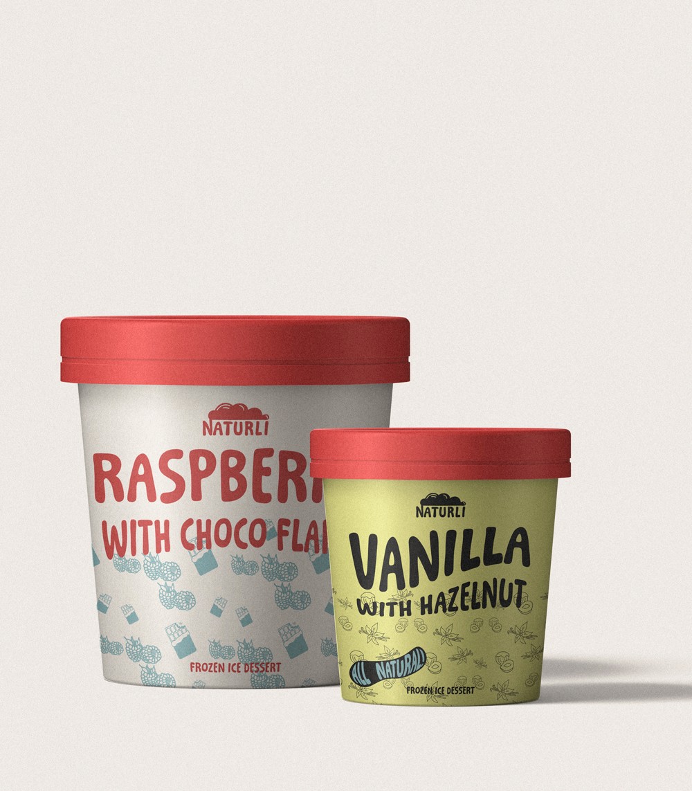
The final packaging leans into bold color-blocking with matte tones, hand-drawn illustrations, and a friendly, chunky typeface to evoke approachability and trust. Each flavor is clearly distinguished while maintaining consistency across the range. Playful icons (coffee cups, oat stems, steam lines) reinforce product use and organic roots. The claim “Be the change.” sits proudly at the base as a call to action and value statement. The result is a packaging system that feels proudly Danish, confidently modern, and refreshingly honest—just like the product inside.